A Reimagined Design System to
Power a Bold Brand
Background
In 2024, we embarked on a bold redesign of e.l.f. Cosmetics’ eCommerce experience to reflect a more expressive, community-driven brand. This initiative focused on enhancing storytelling, incorporating social proof and community engagement, and elevating personalization throughout the user journey.
This wasn’t just a visual refresh—it was a strategic shift to deepen emotional connection, surface relevant content at key touchpoints, and modernize the shopping experience for a mobile-first audience.

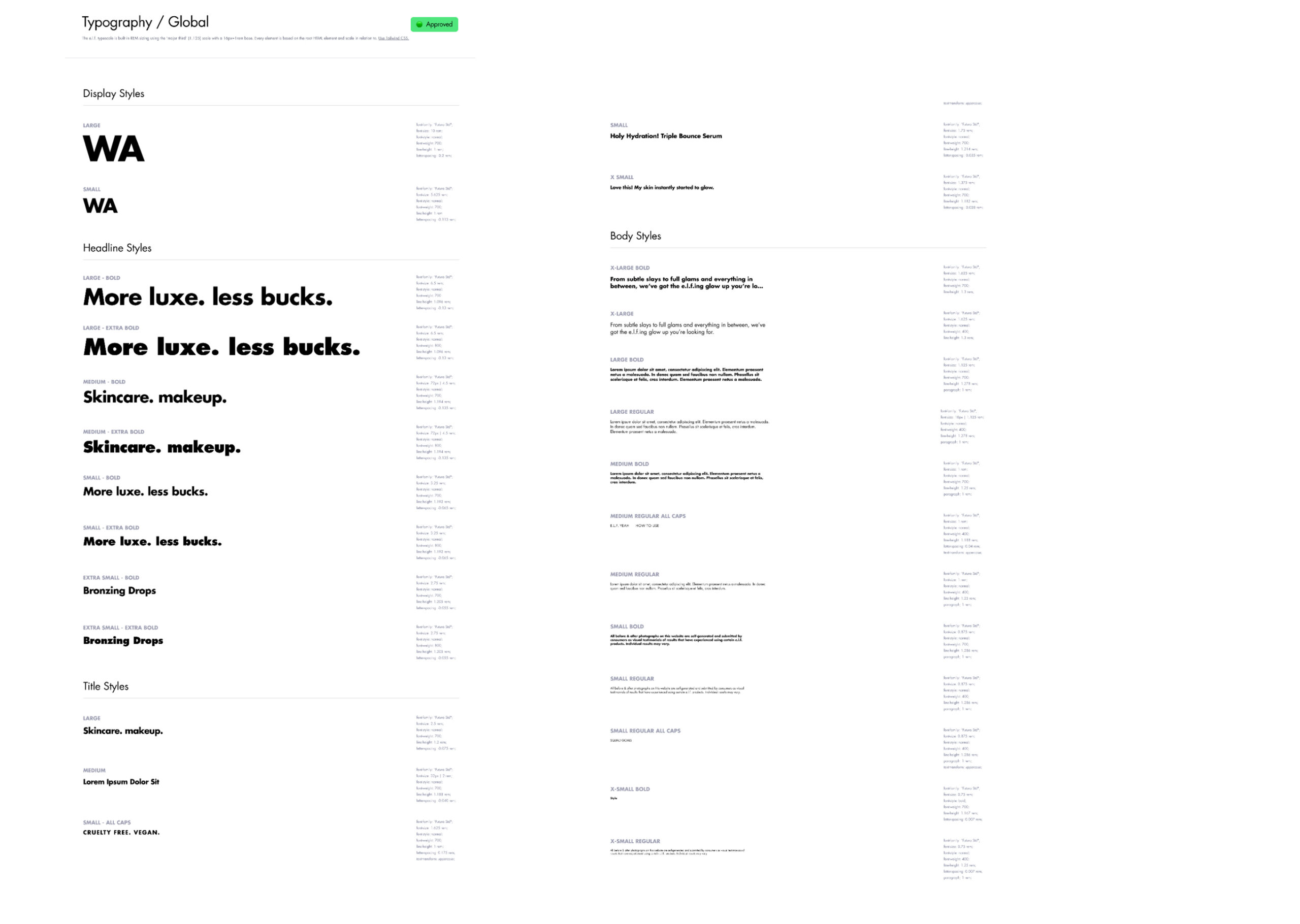
Foundation First: Rebuilding the Design System
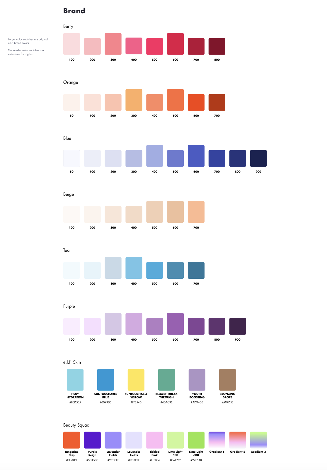
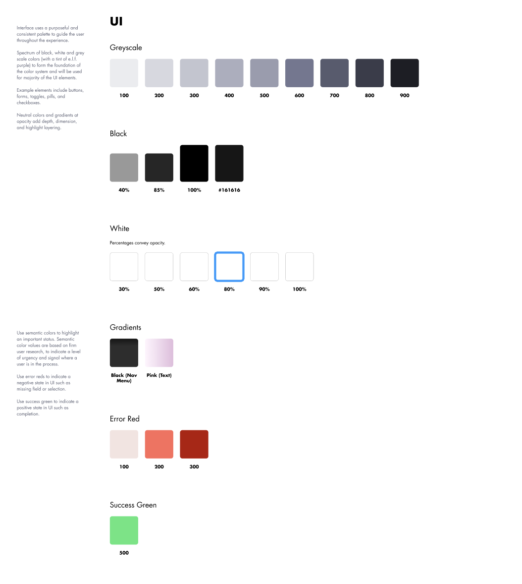
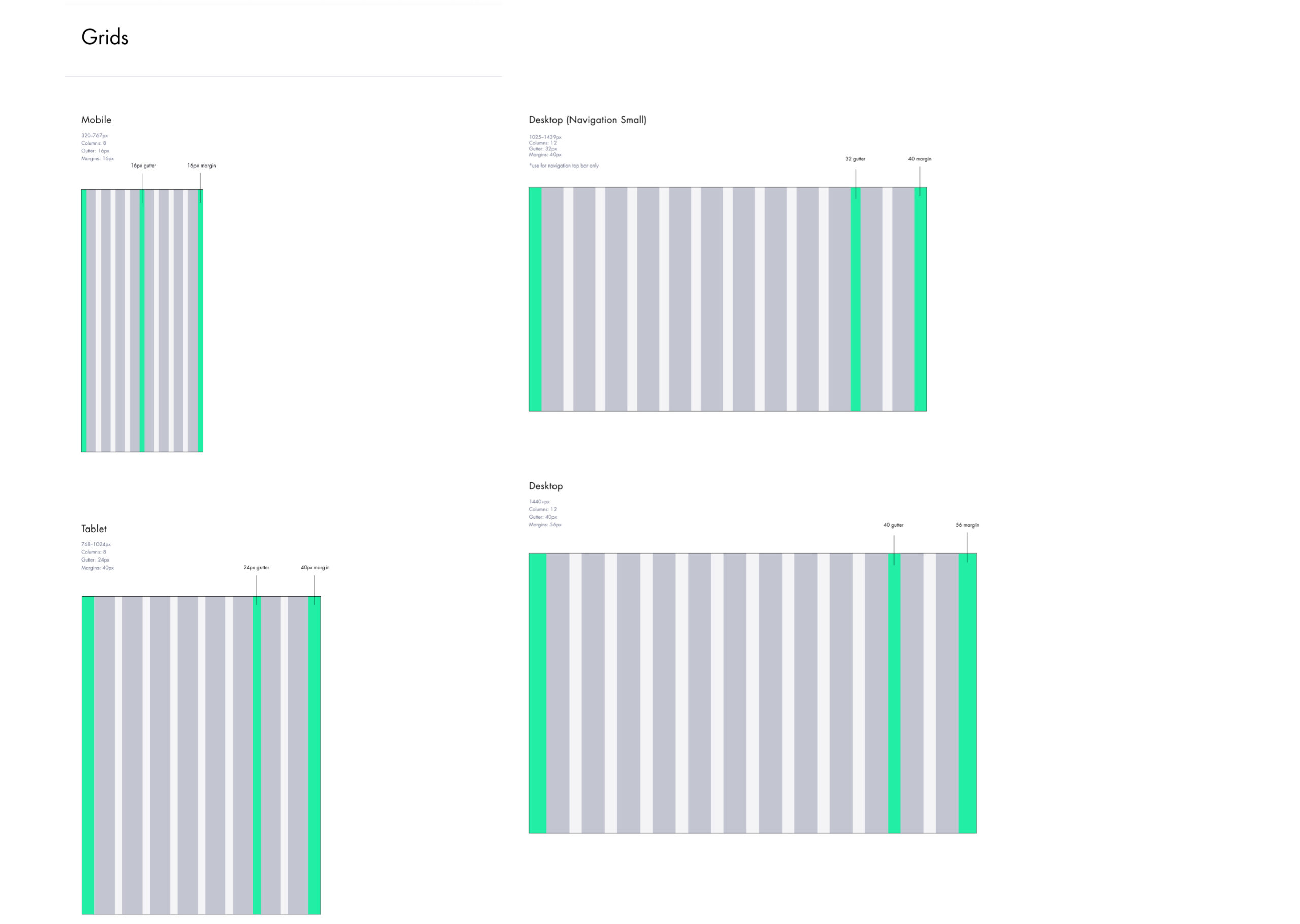
To enable this transformation, we started by rethinking the foundation. The previous design system (shown above) was rigid, fragmented, and unable to scale with the brand’s evolving needs. I helped lead the overhaul—rebuilding the system from the ground up to support flexible layouts, campaign storytelling, and reusable UI patterns across multiple categories.
My role spanned UX strategy and mobile-first UI design. I redefined core elements like typography, spacing, component behaviors, and documentation—all with a focus on clarity, speed, and adaptability.
The result: a cohesive design foundation that empowers our teams to work faster and more consistently while supporting a bold, human, and high-impact digital brand experience.
Driving Adoption, Alignment & Scale
Our design system wasn’t just a UI overhaul—it was a foundational shift in how we collaborate, scale, and maintain quality across e.l.f.’s digital ecosystem.
- Who it serves:
The system was built for cross-functional teams across design, engineering, and marketing. It ensures visual consistency across seasonal campaigns and evergreen shopping flows, while giving designers and developers a shared language to work more efficiently and creatively. - What it solves:
Before the redesign, duplicated components, inconsistencies in mobile behavior, and unclear spacing rules led to slower design velocity and friction in implementation. The new system brought clarity, cohesion, and flexibility—supporting both high-volume product updates and expressive campaign needs. - Who I partnered with:
I worked closely with internal product managers, engineers, and our creative agency partners to define the system’s structure and priorities. This collaboration ensured that the components were not only visually aligned, but also technically feasible and built with real-world constraints in mind. - Is it coded?
Yes. While I led the UX and UI architecture, we partnered with our dev team to bring components into a live coded library. I contributed to naming conventions, states documentation, and design–dev handoff practices to ensure seamless implementation. - Governance & documentation:
We implemented documentation through Figma libraries and Confluence, establishing usage guidelines, accessibility notes, and examples. Governance is ongoing—with regular audits and a feedback loop across teams to support evolution over time.
This holistic approach made the system not just a set of files, but a tool that accelerates how we design, build, and ship—tied directly to business goals and brand expression.
From System to Story: Bringing the Work to Life
With the new design system in place, we began applying it across the site—bringing e.l.f.’s refreshed brand expression into real user moments. From homepage takeovers and navigation updates to reimagined product detail pages and community-led content modules, every touchpoint was an opportunity to activate the system and make the brand feel more alive, intuitive, and inspiring.

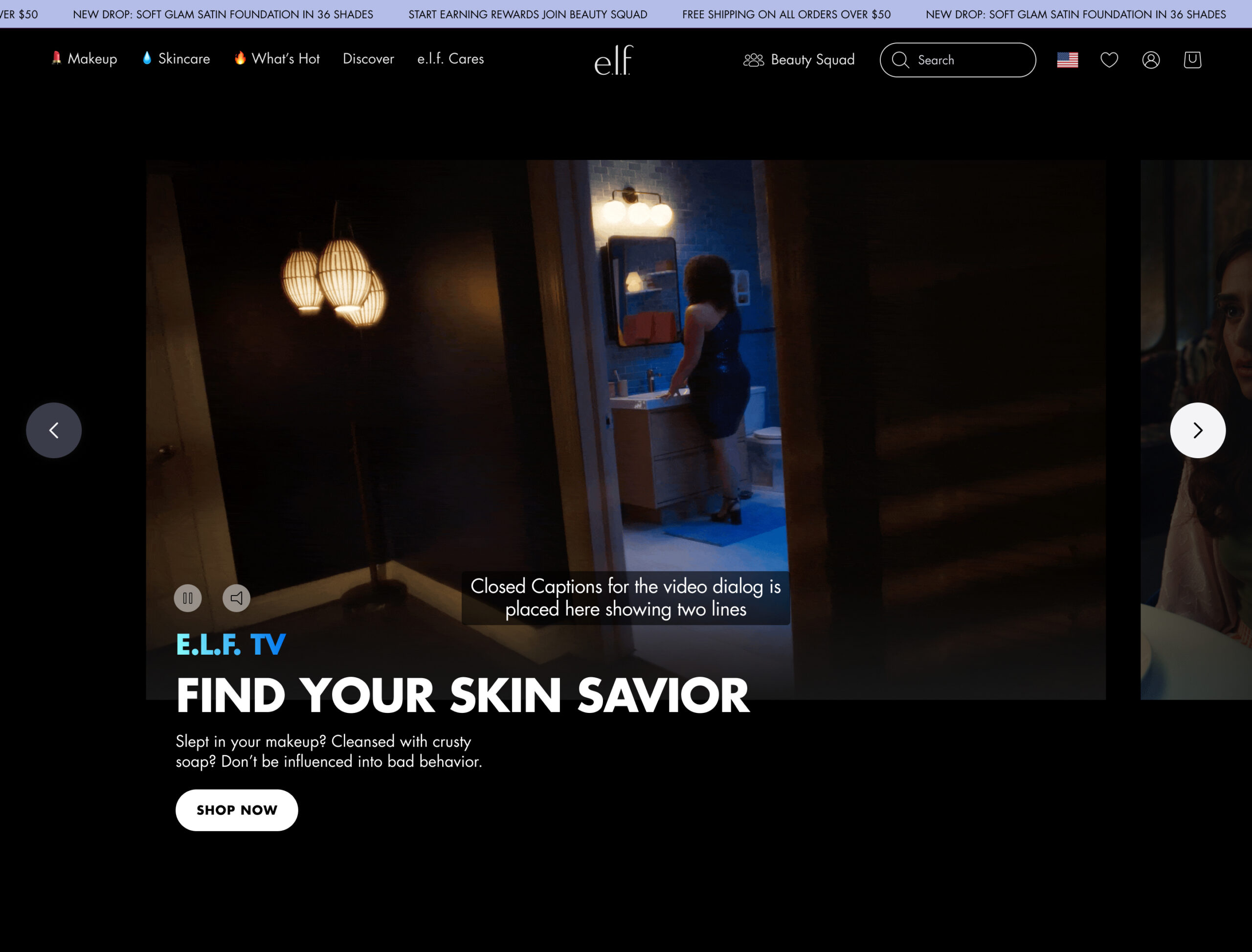


To better reflect e.l.f.’s bold, expressive brand voice, we reimagined the global navigation with a playful yet purposeful approach. By integrating emojis alongside category labels, we added a layer of personality that felt fun and scroll-stopping—without compromising clarity.
We also introduced a simplified mega nav designed to reduce clicks and surface key categories at a glance. This update made it easier for users to discover new products while still providing a streamlined path to familiar favorites.
Since launch, we’ve seen a measurable increase in engagement, with more users exploring beyond their typical paths—navigating deeper into categories and interacting with a broader range of products. The redesigned nav is not just more intuitive—it’s driving real behavior change.
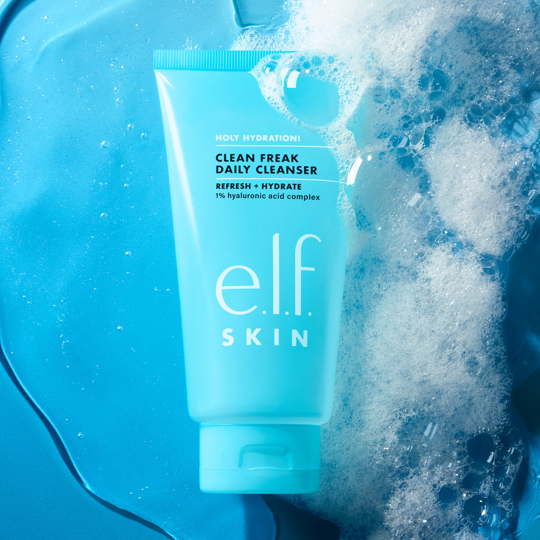
Product Pages + Refined Shade Selection
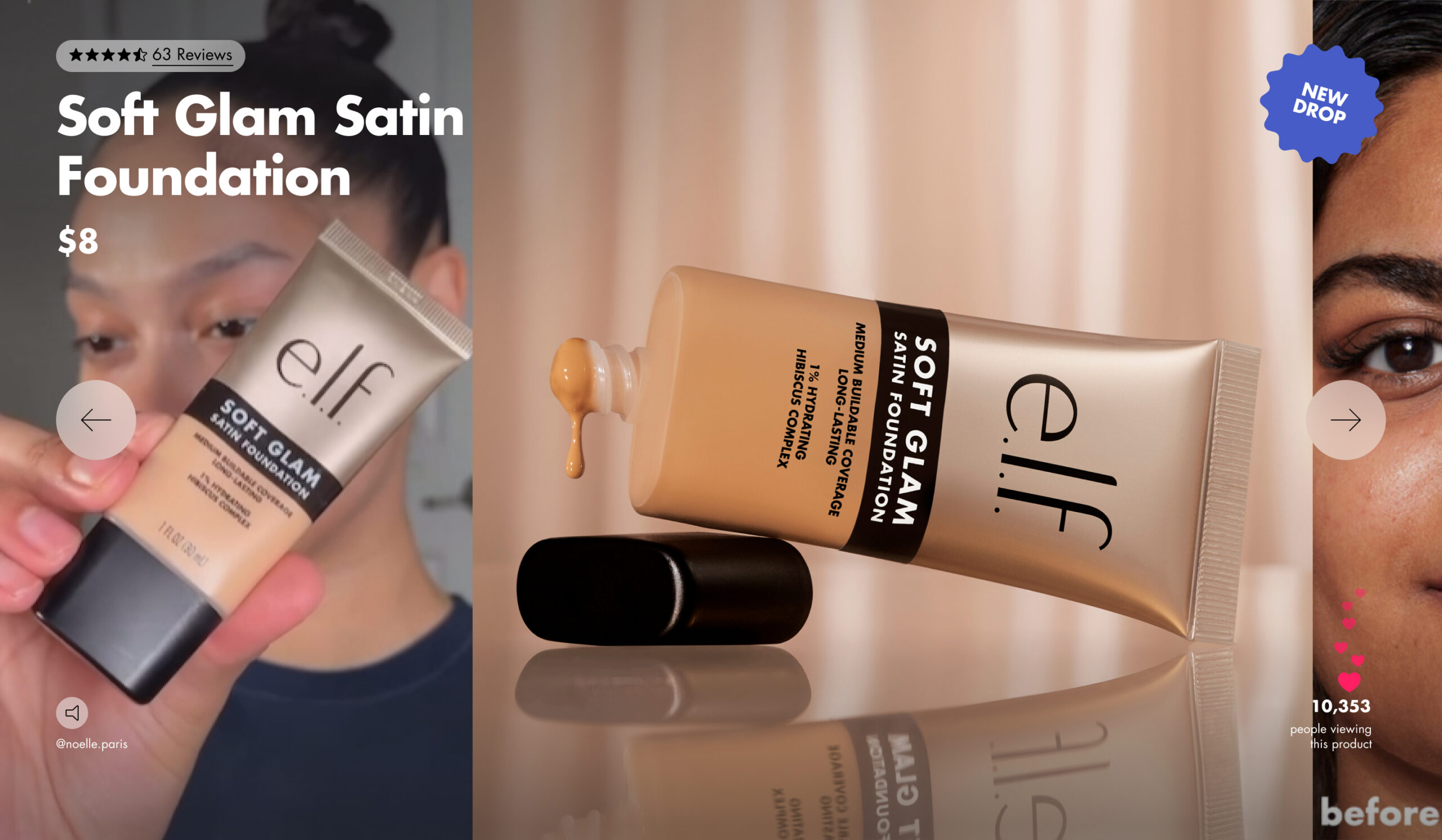
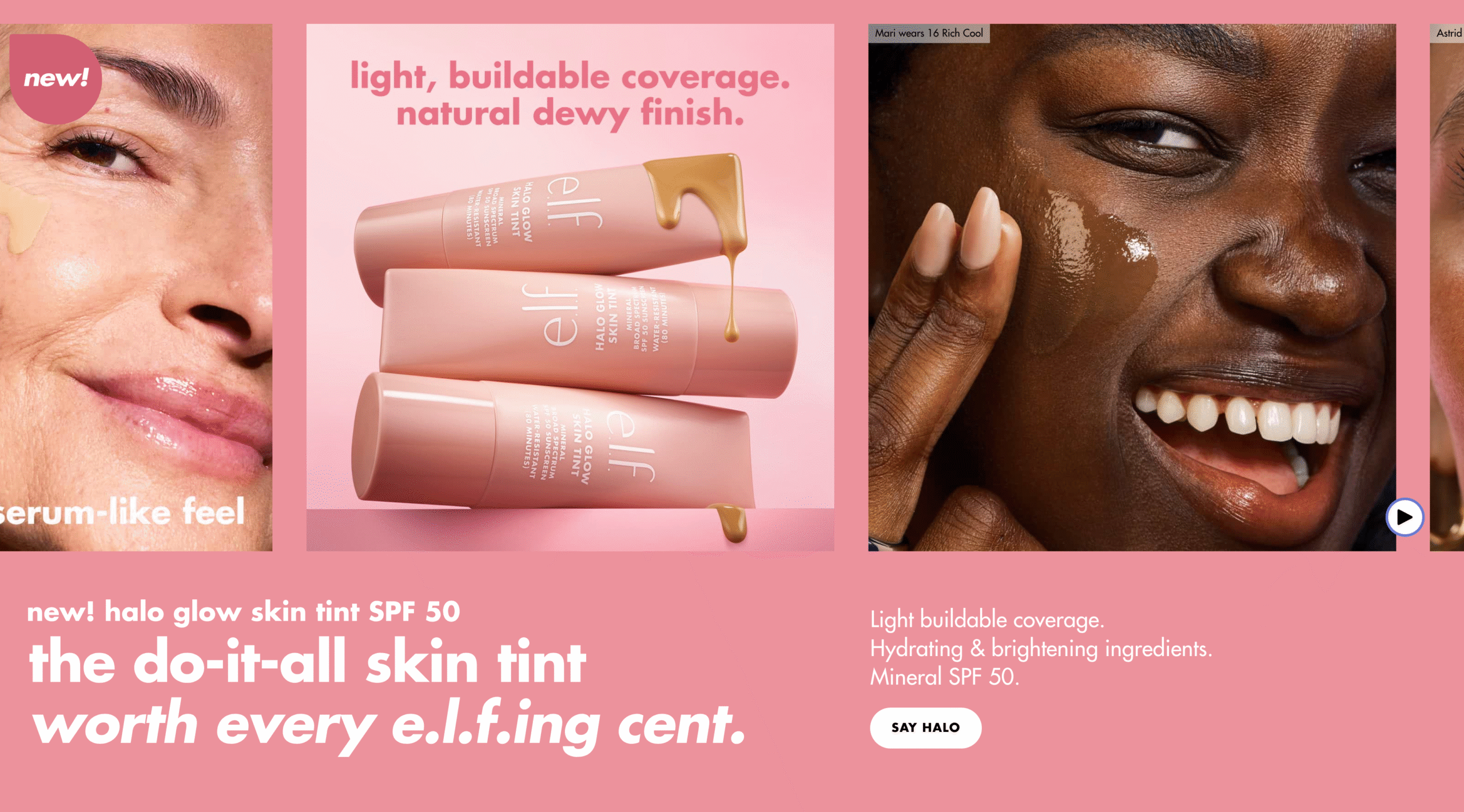
We introduced a new hero module on our best-selling (holy grail) product pages to spotlight customer reviews, social proof, and campaign-specific visuals. This enhancement brings a sense of freshness to the experience while reinforcing key brand moments. It also extends the campaign narrative directly onto the PDP, turning it into a meaningful touchpoint that educates and inspires at the point of consideration.

Due to the number of shades available for a handful of color products (40 for some), it can become challenging to find a matching shade as well as quickly select a familiar shade for returning users.
Objective
Give refinement options to reduce the number of product swatches. In considering the primary method of selection (swatch image), I wanted to offer a more straightforward process for returning users to select their desired shade if they know the shade’s name, so a simple dropdown select box was introduced in place of the static shade name (next to the “color” label).
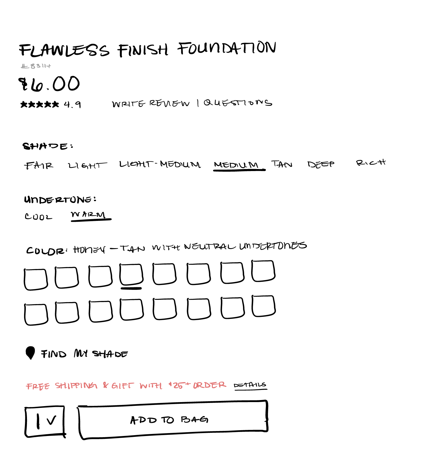
As part of the product detail page redesign, I conducted a thorough audit of all existing content and UI elements. The goal was to reduce visual clutter and ensure that every piece of information served a clear purpose. This process allowed me to shape a simplified, more intentional information architecture—one that surfaces what matters most to the shopper without overwhelming them.
How It Works
Shoppers can use the Shade and Undertone filters—individually or together—to narrow down options. With each selection, the dropdown list and swatch display dynamically update, showing only the shades that match the selected criteria. This interaction model keeps the experience focused, relevant, and responsive to user intent.
Social & Community Buzz
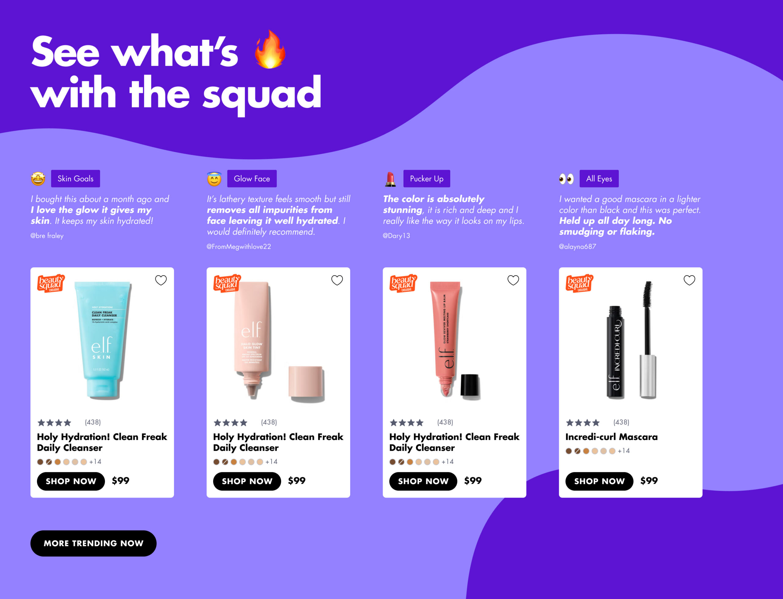
Following the introduction of social reviews on the product detail page, we extended this treatment to the homepage by testing a new recommendation format centered around community feedback. Rather than relying solely on traditional “You may also like” modules, this approach framed product discovery through the lens of real customer reviews—bringing the voice of the community forward in a more prominent way.
This direction was inspired by a key insight: product reviews are a powerful influence during the consideration phase. By leading with authentic user experiences, we aimed to build trust and encourage deeper exploration across our product catalog.
Skincare Finder
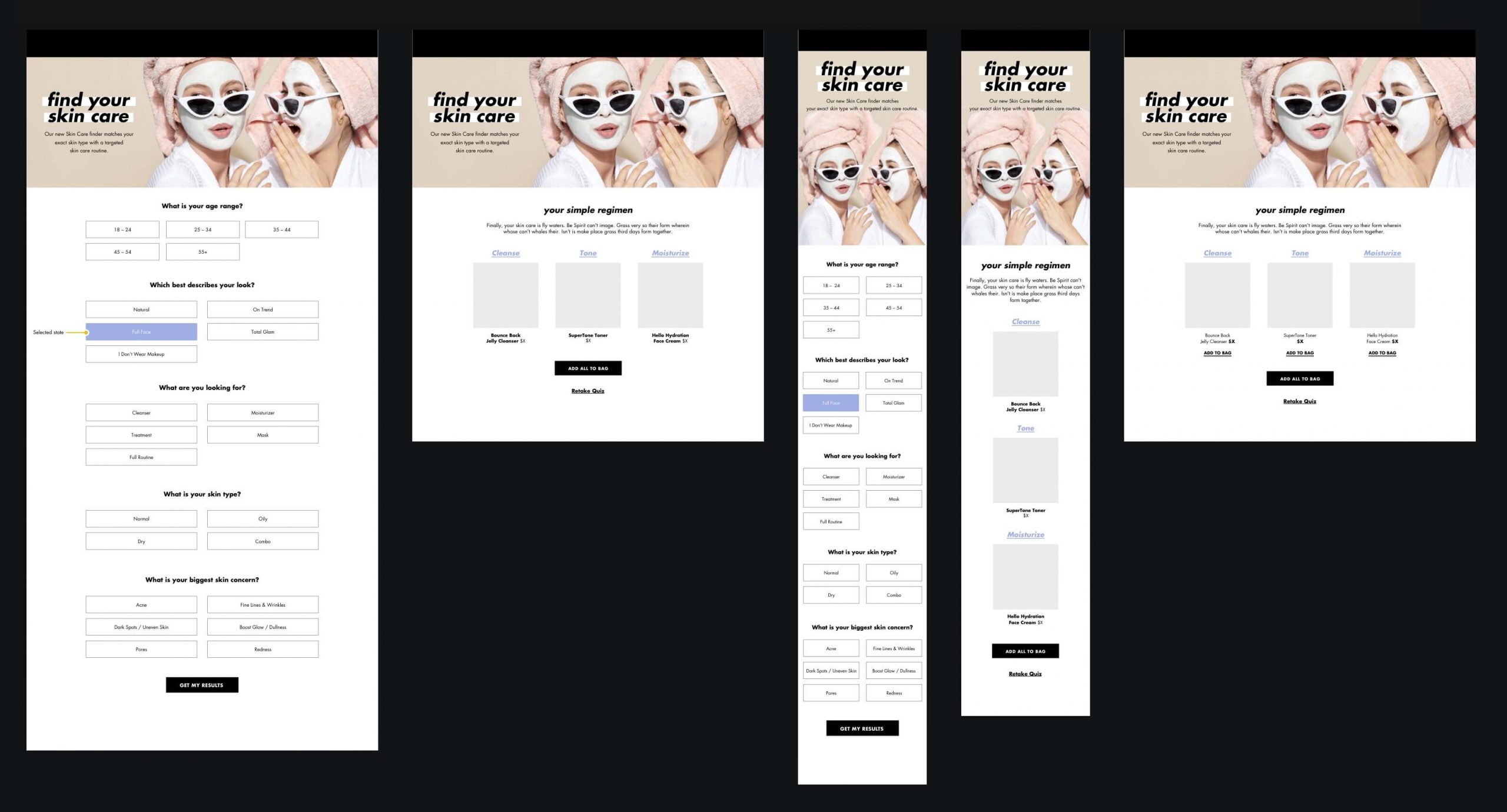
Worked with the product innovation and CRM teams to create a set of questions that can feed their understanding of consumer interests and needs. These questions were also vetted from a marketing perspective so that we can target particular audiences and personalize the site based on those same interests and product needs for skin concerns.
Consumers who utilize the product finders now convert at 2X the rate of those who do not.
Gift with Purchase + Loyalty Rewards
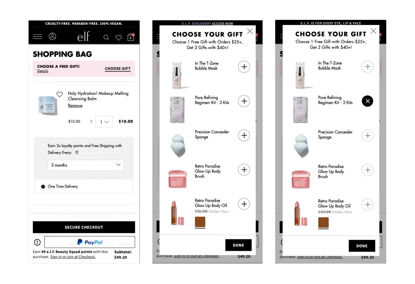
In meeting with the customer service team during our reoccurring connect, they’ve raised the need to increase the visibility of the gift with purchase (GWP) offer since some customers would check out without adding it, then reach out later since they forgot.
A few things were done to increase visibility:
- Reposition the GWP offer within the shopping bag (based on frequent scroll depth on the page)
- Use of attention-grabbing (brand) color
- Redesigned experience to make selection of item(s) more intuitive as well as giving the user the flexibility to modify their selection later
Concept
Screen One: First, the user is presented the GWP banner when the qualifying threshold is met.
Screen Two: Upon selecting the “Choose Gift” button, the available items are displayed coupled with the related promotional callout. Prices were omitted to subtly remind the user that these are complimentary items.
Screen Three: If the current Gift with Purchase offer allows for the selection of more than one item, the user can continue to select up to the maximum. At this point, all other unselected items will become disabled and indicated with the softer icon color and tooltip notice, if tapped.
Once the modal is closed, the initial button (i.e., “Choose Gift”) is updated to read “Update My Gift.” This option will allow users to update their selected item(s).
Results proved beneficial. Fewer calls and messages were sent to the customer support team monthly due to increased use of the free gift module.
Increasing Lifetime Value (LTV) with Reordering
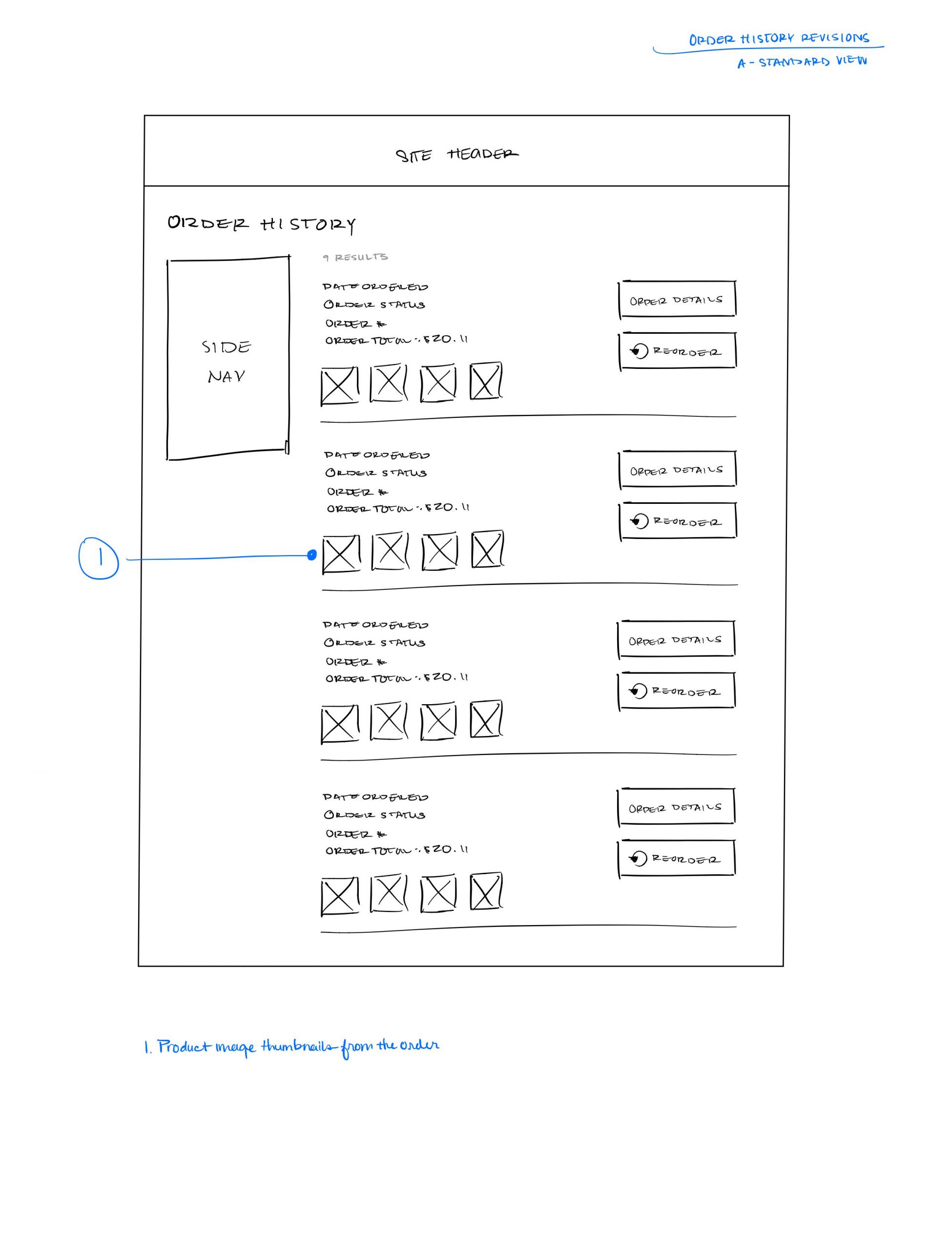
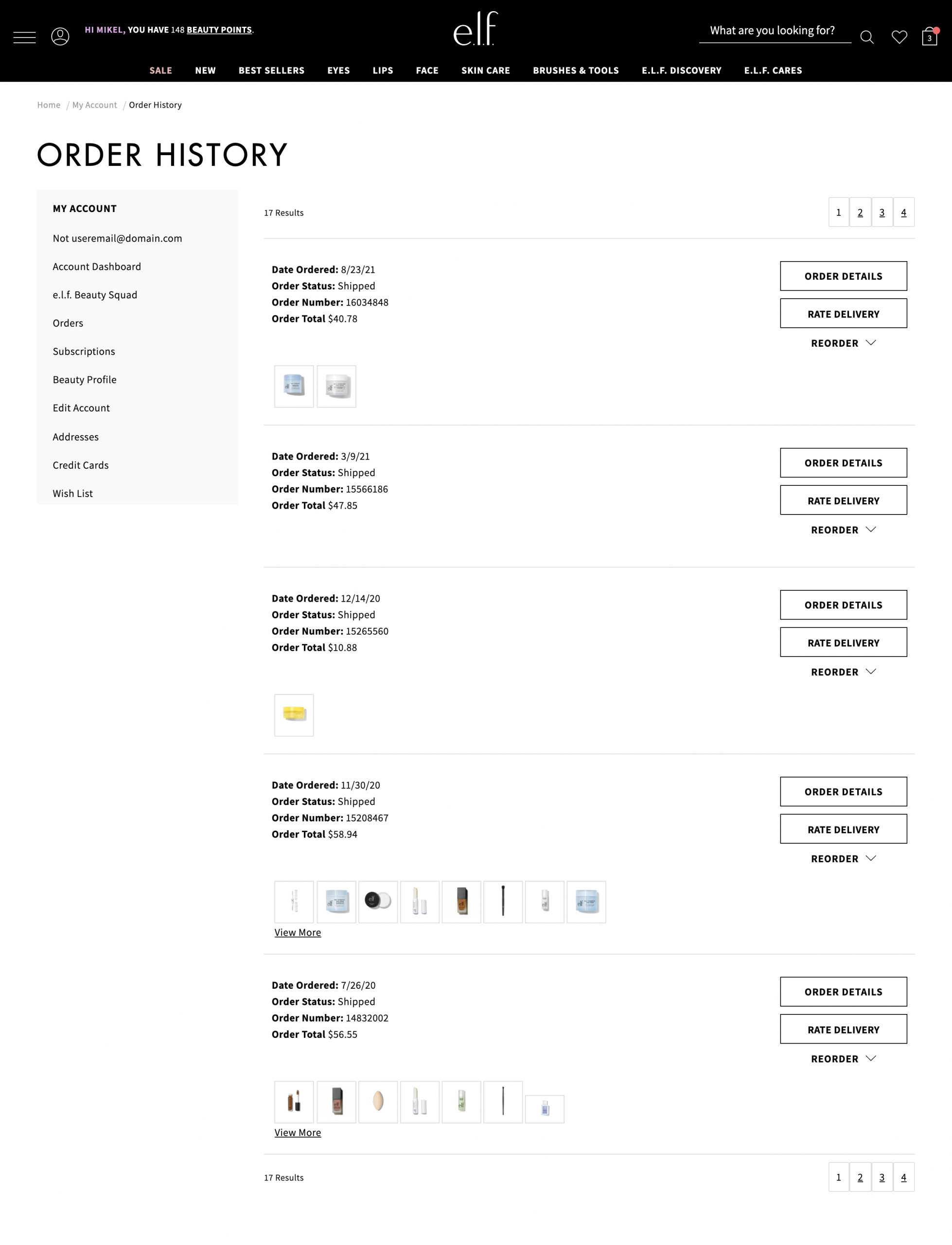
Order history page with the order summary containing products for quick identification. A reorder button is also included to quickly reorder your faves.
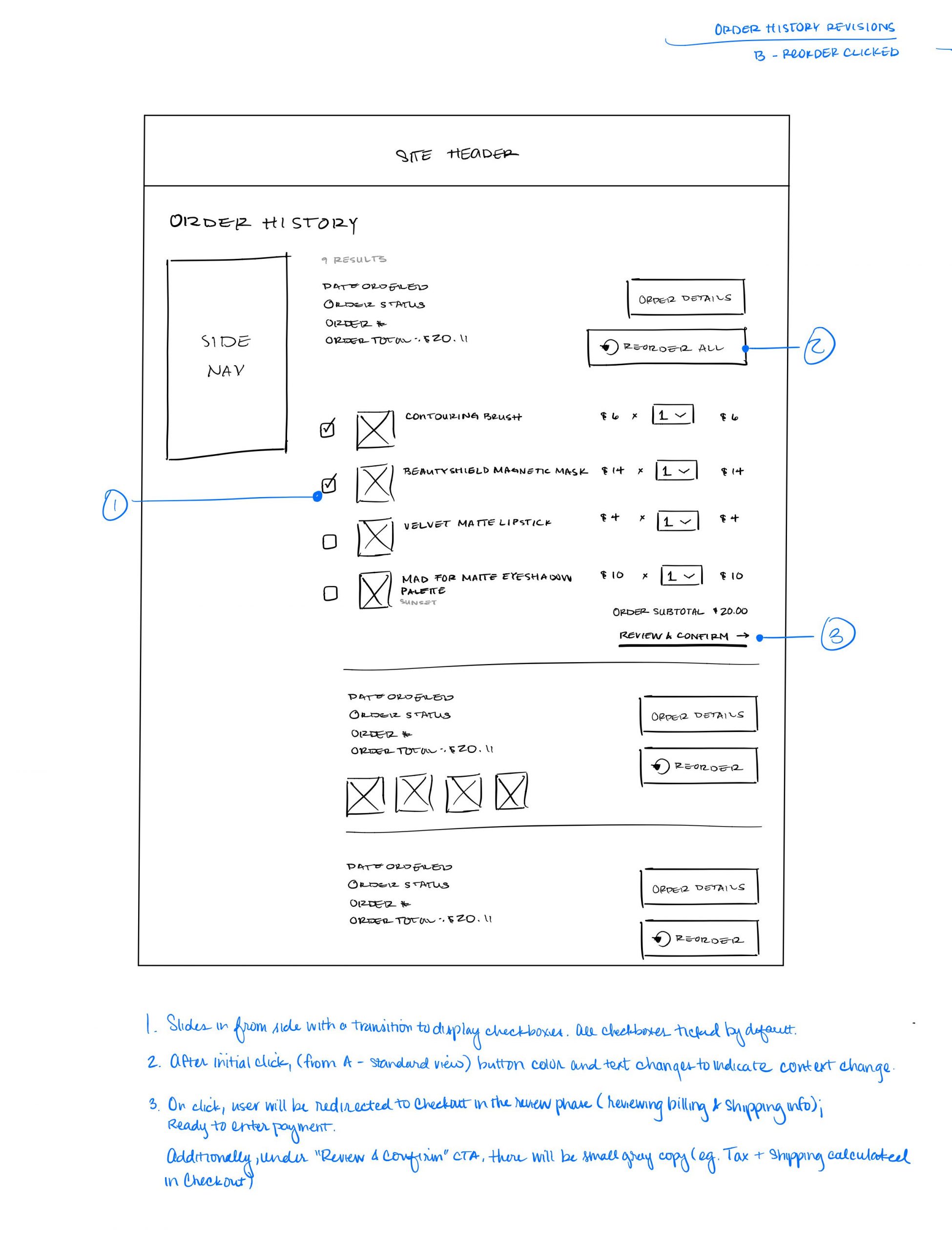
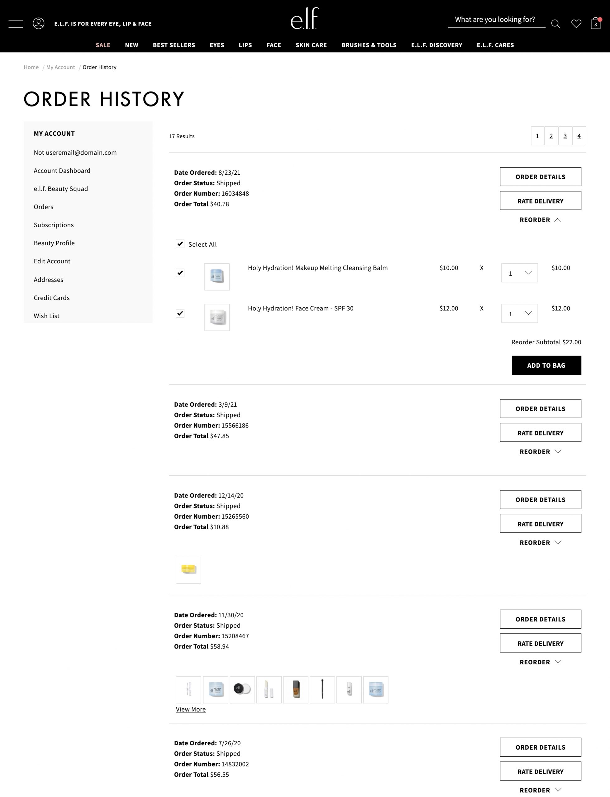
When the Reorder section is expanded, the full product details are shown with the option to (de)select items the user would like to reorder. The order subtotal also dynamically calculate the user’s selections.